Coral Springs, Florida
(954) 613-2894
Menu
Brand identity / A system people can recognize
Make the business recognizable before they read the name.
- Pricing
- Quoted separately
- Output
- Reusable system
- Website
- Can be combined
Your website, social posts, proposals and printed materials should feel like they came from the same company. We turn the real character of the business into a clear visual and verbal system your team can actually use.
01 / Selected systems
A system should show its thinking.
Maternal Mind needs warmth without vagueness. Formation needs speed and coordination. Sicuro needs clarity when decisions carry weight.
Brand operating system / selected excerpt
01 / Selected work
Maternal Mind & Wellness
A soft-spoken identity that still behaves like a system: exact lockups, a restrained palette and clear editorial hierarchy.
- Role
- Care + trust
- Logo suite
- 11 variants
- Type
- Newsreader + DM Sans
Identity 03 / Selected excerpt
 Mark
Mark Lockup
 Live
Live02 / Selected work
Formation
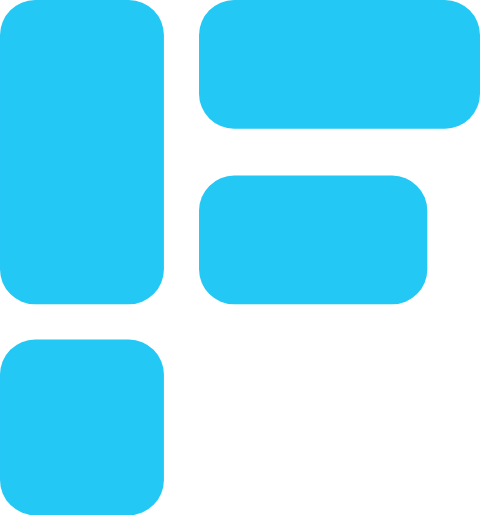
Four modules form one F. Signal cyan appears only for active movement, while the dark field carries the product.
- Mark
- 4 modules
- Signal
- Cyan means live
- Canvas
- Deep navy
Healthcare identity / selected excerpt

03 / Selected work
Sicuro Health
The cross stays recognizable inside the wordmark. Deep navy carries trust, red carries urgency and the type stays direct.
- Mark
- Cross + wordmark
- Color
- Red + navy
- Type
- Figtree + Public Sans
A logo, a few colors and a font do not make a brand system.
Without decisions about hierarchy, voice, contrast, imagery and day-to-day use, every new piece of marketing starts over. The result feels inconsistent even when the individual parts look polished. We define the rules that hold those parts together without making the system rigid or difficult to maintain.
02 / What we do
A working identity, not a mood board that gets forgotten.
The exact scope is agreed before work begins. These are the building blocks we use to make the identity useful across real customer touchpoints.
- 01
Brand direction
We define the audience, useful points of difference, desired perception and visual territory before choosing surface details.
- 02
Color and type system
Primary and supporting colors, typography and hierarchy are chosen for recognition, readability and practical use.
- 03
Voice and messaging
Core language, tone and message priorities help the business sound consistent across web, sales and social content.
- 04
Usage guide
A concise guide shows how the pieces work together so future materials stay recognizable without constant redesign.
03 / Common questions
Useful answers before we start.
Clear scope, useful files and no invented promises about what a brand can do.
Can you work with our existing logo?
Yes. If the logo still represents the business and works at the sizes you need, we can build the wider identity around it. If it creates a real limitation, we will explain that before recommending a redraw or replacement.
What do we receive at the end?
The handoff depends on the agreed scope and can include color values, typography choices, messaging guidance, reusable design rules and approved brand assets. We list every deliverable before the project starts.
Is full branding included in the $500 website build?
Basic website visual direction is included in every site. A broader identity system designed for use beyond the website is scoped separately before work begins.
Start with what should feel unmistakably yours.
Tell us how the business is seen today, what is changing and where the identity needs to work.
Start the project brief